InDesign.
Always work on a Document.
Even if you want to print a book, use facing pages.
Working for commercial print:
Photoshop:
-Resolution 300 dpi
- CMYK, Grayscale, Duotone,
-File Format, psd or tiff to put into InDesign.
-Make your work actual size you want it to move into InDesign.
Illustrator:
-CMYK
-File Format ai. Don't cut and paste artwork.
When you place and image into InDesign it creates a link. So if you go to the links menu at the side and scroll over the image name it will tell you where the image is.
So when you got to print you need to take the InDesign document and all the images you want.
Make a folder for all things you have used in your InDesign layout and take this along to the printer so it prints everything.
Fonts & images need to be stored in a folder alongside the Indesign document
Separations:
Colour separations is to see how many different printing plates you would need for your work. Such as screen printing when you have to print each colour seperatly.
Windows - Outputs - Seperations.
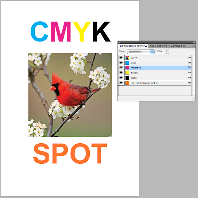
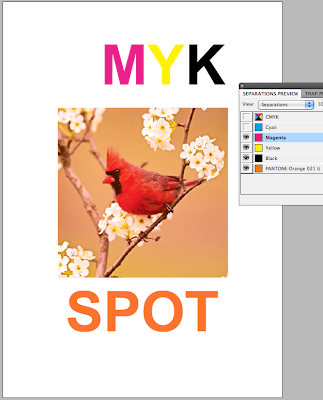
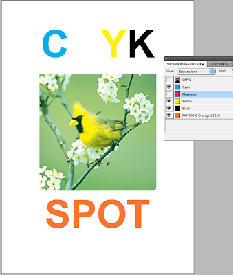
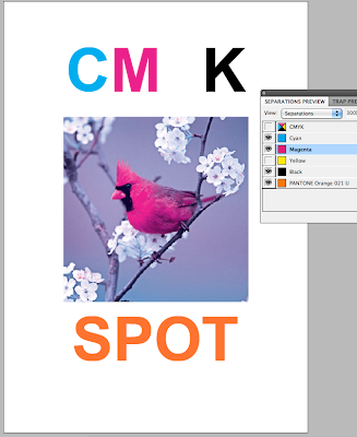
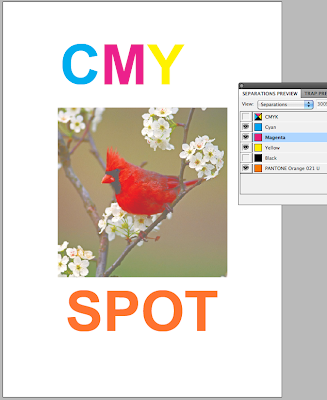
When printing if you go to Output then select separations from the drop down menu, this will then print 5 separate sheets of the same design for each of the different colours. All of which will be in black and white format.

The more colours means more printing plates needed which means the price of the print job will go up and become more and more expensive.
When designing for print, good practice is to clear your swatches from all un used spot colours so there is no confusion of what is going to be printed.
Also when printing add the printing information onto the document such as crop marks and the registrations.
Overprint.
Window - Output - Attributes.
Overprinting allows you to print a two colour document, so using two plates, overprinting would allow you to create another colour from your chosen two colours mixing. Knocking out is when the overprint is not selected and the spot colour will knock out the background rather than print on top of it.
Ink Limit: ink limit is the amount of ink that can be applied to your stock before it starts to discintigrate. Once you know what your stock is and how much it can take..
Once you know this in the separations menu you can go on the drop down menu and select ink limit and set your ink limit. So when overprinting if there is too much ink on the page it will highlight it.
Spot colour - when it goes to print in your swatches you have the colours you have used on your design then add another spot colour to the swatches and ask the printer to not print the spot colour but to spot varnish where that colour is. But make sure that the overprint setting is used with the spot colour so that the colour isn't knocked out, as it wants to be printed on top of the picture behind rather than loose the picture where the spot colour is.
 Different layouts of the type to determine how the proverb is read. Layout depends on hierachy, what is the most important? and what do the people need to know first.


