Monday, 15 November 2010

Interactive CD

Inside the packaging I wanted to have an interactive CD, of which people would put into their computers and gain more information about what they were volunteering for and more about the hospice.

I also wanted to put a design on the CD, yet keep it simple and make it fit within the other designs.

I chose to use the orange for the design, Pantone solid coated 157. I don't particularly like the white CD with the orange writing at all. I quite like the text with the block of colour is quite nice. But i think the strongest out of all these ideas are the scribble designs, because then it still relates to the logo.

I quite like this design above but i am not certain, i think it could be pushed a lot further than this.

Thursday, 11 November 2010

Poster Development. 

I was still not happy with my poster design so these are some of my new ideas and developments from the initial ideas.

 The poster above just has wayyyyyyyy too much text on it. I wouldn't read it if i was waiting for a train because it looks like a lot of effort to read.
I quite like how the type is laid out in the poster above as it looks quite cool. However i don't think this poster would attract people to look at it. It doesn't really grab your attention.

 I then went to try using circle however i really don't want to use circles however i like the lines but again i don't think its interesting enough for students to want to actually read it.
Then i created this! I really like this idea and i think it sort of interests the reader by being a bit of a challenge to work out at first. 

 Different layouts of the poster..


 I think this poster above is my favourite layout!! Maybe the type slightly further down, just slightly.

Wednesday, 10 November 2010

Print workshop 
10.11.10
Above is a colour test. You had to put colours in order of there gradient/tone from one colour to another. And i got 4 colours in the wrong place.

Below we were being taught about how to program your print to the right colour profile according to your printer your printing to and the document profile.

 This print above was the furthest from what it looked like on screen with the colours a lot more pale and pastel sort of colours.


Notes from the lecture:


Monday, 8 November 2010

Packaging.


For my packaging I am going to make an application form, of which will be sent to students to become a volunteer. Therefore i need to package:

-an application form.
-a ready to post envelope.
-a pen to fill it out.
-a cd with more information on it.
-small cards to give to others about how to apply.

I also want to make it fairly modern and attractive to students! quite fresh and bright.


One of the musts of the packaging was that it must fit through the letterbox and hold everything i needed. The size of a letterbox is usually 30cm by 5cm, depending on the style of the letterbox/door.


My initial drawing of my idea for the packaging. I firstly thought about the way in which i wanted the items to be held into the packaging, once i had decided this, these were my first drawings of how i was going to put things together.


I also thought about possibly putting a sleeve around the packaging, possibly with the address and name onto it. However i am not certain that through the post it would stay on. Then the address would be lost.


 How i would make it. My prototypes..


 Also for the packaging to make things a bit more interesting i thought about having the application form attached to the packaging then having it perforated, so the candidates tear if off once they've filled it out.


 My second possible idea. This idea was slightly different in that it all folded out into 4 different parts. However i am not as keen on this idea as my initial idea mainly because the CD would not be as securely fitted in the packaging.

 Although i was still going to keep the perforated application form.


 I have decided to adapt my first idea. I have used the idea of the three sided fold out package however i wanted to make it a5 sort of size. But i needed the application form to be bigger so what iv done is have the application form fold out from the the bottom and fold in half so its perforated to come off, yet its pre-folded in half so it will fit into the envelope of which i will put into the packaging nicely.

 Like this example above, it will be laid out like this and folded in half then folded into the packaging.

Below are designs for the inside of the packaging and the information i need to be in there yet looks like its not too much to read.


Poster Layout Design
I do not know what slogan/tag line to use! however i'll just use: Student Summer Antics. to be able to create some designs.


As one side of the promotion i want to create a poster campaign to make people aware of the charity and also promote becoming a volunteer to the students. I have also thought about where i would put these posters. In such places as the student union wall, bus stops and inside buses, trains and platforms, possibly on the back of pub toilet doors. All places where students would see it.


 For this first design i went for quite a clean cut sort of design, using the pantone colours from the logo. I quite like this design and how it is laid out. It also contains all the information i need it to, to inform the students of what it is and how they apply.


In this design i wanted to incorporate maybe a way of making it relate more to students with more of a interesting font, however i don't think this works at all i think the first design was a lot stronger than this.

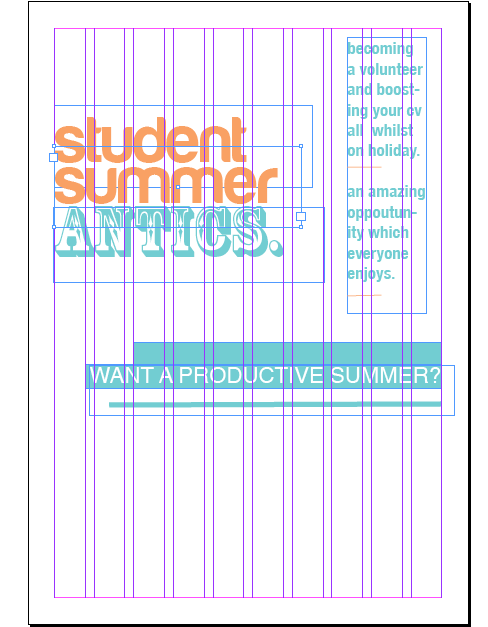
 This third design was using the same sort of grid structure as the first design however in a different way.  I really like this layout, it looks quite eye catching and aimed at students, however i feel there possibly should be some sort of picture in the space in the centre.
This was a slightly edited version of the layout above,  as i decided to try putting the logo above the column of text and moving the text slightly further down. However i still have the problem of the picture in the centre.

 I decided to re-arrange the layout and add more colour to the design. However i'm not really keen i think it looks too childish and i don't think students would look at it because they wouldn't think it was for them, which is not what i want.
 This design was also aimed to have an image in the centre. I quite like the layout and i think it may look quite good if i develop the image and add it to this layout. Although im not certain wether an illustration or a photography would be more affective.

I then decided to try out a poster landscape, as it was something different. However thinking back it wouldn't work with me needing it to go into bus stop and posters for the train and such things. I would also need to add pictures into the boxes down the right hand side.

 I decided to take a picture of the volunteers/fundraisers of the hospice to add to my designs of which needed them in.
 Some development of layout using the photograph within the layout.
 I think i actually prefer the image being smaller than having it large! as then it doesn't take over the full design.

 Do you want a productive summer?
 For the design below i thought about maybe embossing the type that is on the top of the page to make it more interesting? I will try this out!