FORM.FUNCTION.PRODUCTION
Content & categorisation:
-Come up with loads of ideas.
-Do something that excites you
-Exploit every idea/pathway, unpick everything
-What don't people know about it
-What do people want to know about it
-Be informed
Form & Format
-How can it inspire what i'm doing?
-What packaging could give me the inspiration?
-What could the product be like instead of paper based?
Product & Range
-When you've made a product what else can you make to add to it/ improve it
Media & Process
-What process could you use to enhance your idea?
Audience & Interaction
-How will you interest you audience?
-How will they interact with the audience?
Form & Function
-Has to communicate your idea but still be interesting
Scale & Context
-What forms could you do.. Think BIG!


 i created this square above in RGB mode..
 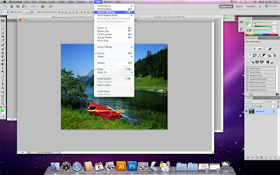 Photoshop is designed to work in RGB however when creating a design for print there are much fewer colours in CMYK thanRGB, so when using RGB mode you can go onto Gamut warning and this will then highlight the colours of which cannot be printed.
 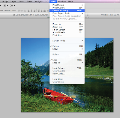 When the colours that cannot be printed in CMYK are highlighted they are turned grey. To reduce the amount of colours which cannot be printed you can adjust the saturation, which will put the colours back into CMYK to print.
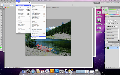 There is also another way to change the colours to transform them into CMYK which is replace colour. This highlights the colours that cannot be printed then you can click on a selection and replace colour will offer you the option to choose a pantone colour to replace the RGB colour.


 Monotone - choosing one pantone colour and transforming your image into that one colour with various tones of that one colour. Making this a one colour print.

 Duotone - the use of two colours in an image. Also with the curves option next to the colours you have chosen you can adjust how much of each colour you want to use and how dark you want it.
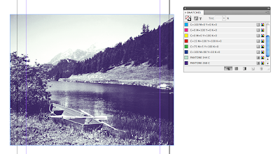 After making and saving your image once you load it into InDesign the two colour swatches are added to the swatches in InDesign.
  Content & Categories: