
Monday, 31 January 2011
Open publication - Free publishing - More photography
Photographs i have taken to try a test of using still type alongwith moving type.
Photographs i have taken to try a test of using still type alongwith moving type.
Sunday, 30 January 2011


I do quite like it, but instead of two pencils maybe a pen and a pencil something like that. As two pencils doesn't really make sense.
Visuals -
For my branding i thought it would be pretty cool to add an image in with the type as this is what i am hoping to do with my animation.
I thought the glasses would be a good idea with there being two o's in the word 'uncool'

Now for the type!
Which type will best suit being alongside the glasses and also represent uncool.


Branding!
As my animation is 'The top 10 reasins why i was not cool in school' and it is for a comedy program I want the logo to be kind of fun!
As my animation is 'The top 10 reasins why i was not cool in school' and it is for a comedy program I want the logo to be kind of fun!
Open publication - Free publishing - More type
For the type i want to use two different fonts for Uncool and school. For Uncool I want it to bee sans serif i think and thin. Whereas the school maybe slightly thicker? Possibly sans serif.
For the type i want to use two different fonts for Uncool and school. For Uncool I want it to bee sans serif i think and thin. Whereas the school maybe slightly thicker? Possibly sans serif.
Thursday, 27 January 2011
Type - Week 3
We have been asked to fill 1.5 pages worth of information into an A5 leaflet.
Points to consider:

This is my first attempt. Smallest point size - 8.5 & includes all information required.


We have been asked to fill 1.5 pages worth of information into an A5 leaflet.
Points to consider:
Alot of text - double sided.
Printing alot - black and white to keep costs down.
Hierachy!
Catch people's attention

This is my first attempt. Smallest point size - 8.5 & includes all information required.

This is my second attempt, i think i prefer my first one even thought there are only subtle differences.

Third attempt: in this design iv gone back to using my initial layout of my first design and then added the pieces from the second layout, such as the line and narrow'er' column on the front page.

Every client will want their logo to stand out. How do you make different logos stand out just the same, even when they are differently designed?
Put them in a grid? such as a square?
Then this deters you from looking at them
or looking at them as a whole.

Wednesday, 26 January 2011
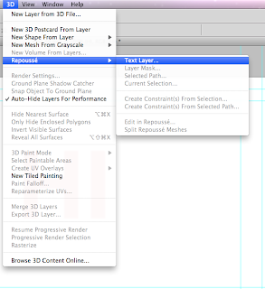
Cameras and 3D in After Effects
After creating a Film&Video file in Photoshop, I then typed the word 'Hi' and went into:
3D - Repouse - Text Layer...

Once you have made the text how you want it in Photoshop, you then save it as a photoshop file and import it into After Effects.
 Once it is in After Effects you have 4 sections. In the 'controller' section you can edit how you rotate around the word, setting key points as you move it around.
 Then there is the camera section, this is where you can move the camera around your 3d image/text using 'position' x,y,and z rotation.

After creating a Film&Video file in Photoshop, I then typed the word 'Hi' and went into:
3D - Repouse - Text Layer...

Once you have made your text 3D you can then edit the settings such as the depth of the 3D effect.

Once you have made the text how you want it in Photoshop, you then save it as a photoshop file and import it into After Effects.


Tuesday, 25 January 2011
visual IDEAS..
Im going to take pictures of certain stereotypical aspects of a 'nerd'. Such things as: bow ties? Short trousers, hair, glasses, braces? Back pack, lunch boxes, plastic watches? Then I want to create something like the channel 4OD advert using a lot of different images, make some of them animated, and also add animated text to the images.


Also for the first frame of the introduction to what i am actually advertising i wanted to play around with using the cameras in After Effects to pan around the title.

Type - Week 2


I thought with it being a delicate quite clean typeface it would represent some sort of cleaning product or feminine product. On the other hand i didn't think it would suit The Sun at all being in a newspaper as to me it looks like quite an expensive font.
Our next task was we were given a list from a decorator and we had to put the information in hierarchy of which we thought was most important then design an advert for the yellow pages. It had to be 60:30 and had to be legible, of which we decided that 8pt was the smallest point size we could go to for it still to be legible.


Thursday, 20 January 2011
Wednesday, 19 January 2011

For my animation I want to take photographs of a stereotypical nerd. Photographs of their hair, bow tie, budgies, shoes, maybe their watch. All the things that make them a nerd.
I also want to take pictures of other things that would make them 'un-cool'


A selection of photos in there environment of things that would not make you "cool"
Audio in After Effects.
File Formats: Aiff, WAV, mp3
If it isn't one of these formats use 'Switch' to convert it.
File - Import - Choose File - Footage.
Audio acts just like an image/ text in that it creates its own layer.
The main difference is unlike an image it has a fixed length and will only last for that long.
This can be moved where you want it along the timeline.
You can have as many pieces of audio as you'd like and also adjust the volume and fade a sound out using:
Audio - Audio levels - Adjust the dB whilst adding key frames at different times. Getting louder and louder at each key point or quieter and quieter.

You can also use the Waveform underneath to see when a noise is made along the timeline. This would help if you wanted to sync the noise to an animation.
Also to chose one section of the audio you can just trim it by using the arrows at the end of the bar on the timeline. For example underneath there it shows that the section highlighted is the only section that has sound.

Also When saving to add your type to your animation you MUST tick the audio output button!


File Formats: Aiff, WAV, mp3
If it isn't one of these formats use 'Switch' to convert it.
File - Import - Choose File - Footage.
Audio acts just like an image/ text in that it creates its own layer.
The main difference is unlike an image it has a fixed length and will only last for that long.
This can be moved where you want it along the timeline.
You can have as many pieces of audio as you'd like and also adjust the volume and fade a sound out using:
Audio - Audio levels - Adjust the dB whilst adding key frames at different times. Getting louder and louder at each key point or quieter and quieter.
You can also use the Waveform underneath to see when a noise is made along the timeline. This would help if you wanted to sync the noise to an animation.
Also to chose one section of the audio you can just trim it by using the arrows at the end of the bar on the timeline. For example underneath there it shows that the section highlighted is the only section that has sound.

Also When saving to add your type to your animation you MUST tick the audio output button!

-
If you have designed something in After Effects then decide later on that you would like to swap it for.
Firstly make the file the same size
Select the layer at the bottom left
Hold down ALT
drag the 'asset' or different piece of artwork onto the selected layer
Then you will keep all the key frames and work you had made just changed the layer to your new design.
Parent/Child Relationship.

It is a lot like grouping. If you have say 15 layers and you want them all to do the same thing altogether you can go to the 'Parent' column select all layers but the one you want to be the parent, then click 'none' and chose which layer you want to be the parent, they will all change from 'none' to the name of the layer. Then you only need to edit the 'Parent' layer and all the other layers will do the same functions.
Except opacity.
For example if you were to make a car. You would need all layers to move forward but and the same time you would want the wheels to go around. So the shape of the car would be the 'Parent' and the wheels would be individual by spinning but follow in direction.
Also...
If you were to make a car and wanted the design to follow the path rather than just stay horizontal to the path go to:
Layer - Transform - Auto Orient

Nesting

Nesting is when you have created an animation with multiple different layers, then you open a new composition then down the left hand side drag the number composition down into the left hand corner. This will then merge the layers and features of that composition and make it one layer in your new composition. However it will not flatten anything so once it is in a new composition you can still edit the features of that layer.
Layer - Pre.compose
That will turn a composition from being multiple layers to one layer of which you can still edit
Tuesday, 18 January 2011
Final Silent Movie
Click 1 from Kimberley Sandford_91256 on Vimeo.
Click 2 from Kimberley Sandford_91256 on Vimeo.
Bounce 1 from Kimberley Sandford_91256 on Vimeo.
Top 10 Worst Decisions.. Might call the program Bad Decision?? Make it comical.
What bad decisions have people made?
When were those decisions mainly made?
What would make it comedic?
Bad decisions tend to happen growing up and learning..
Possibly mostly in school?? College?
Could possibly look at childish decisions?
Make it funny and things people would find funny or have experienced/relate to.
What do people go through in school? secondary school i think would be funny.
Peer pressure
- to look good: Hair, Make-up, Clothes
-to act cool: walking, confidence, looking 'hard', shouting at a teacher.
-not being bullied, or being a nerd
-fancying someone
- skiving off
I want to do a title sequence for a comedy program about a man who looks back at all the bad decisions he made in secondary school, from a stereotypical nerds perspective.
Top 10 Best/Worst
Ideas.
Whatever i decide to chose as an idea i would like to make it into a comedy program..
Ideas.
Whatever i decide to chose as an idea i would like to make it into a comedy program..
sports injury
embarrassing moment
quote a child has asked a parent
home cooked food
school dinners
comedians
school photos
falls
decisions
- i think i quite like the idea of decisions
- i think i quite like the idea of decisions
poster designs
tv moment
phone calls
spelling mistakes
number 1 singles
Monday, 17 January 2011
Click - First Attempt
I quite like this idea! I also think it works quite well to actually represent click.
Untitled from Kimberley Sandford_91256 on Vimeo.
I quite like this idea! I also think it works quite well to actually represent click.
Untitled from Kimberley Sandford_91256 on Vimeo.
Sunday, 16 January 2011

Wednesday, 12 January 2011
Tuesday, 11 January 2011
Correcting my Bounce..
I had such a problem trying to make the bounce of the 'o' smoother and make it less staccato.
After playing around for a while on After Effects I found an alignment option of the letter on the path.
 At the 'Groupin...lignment' section i edited the alignment of the letter to the path as shown below. Which has now given the bounce a smoother movement!! Yey!

The slight thing wrong with this animation is the fact that i need to speed up the bounce and make it work on 5 seconds.
I had such a problem trying to make the bounce of the 'o' smoother and make it less staccato.
After playing around for a while on After Effects I found an alignment option of the letter on the path.

The slight thing wrong with this animation is the fact that i need to speed up the bounce and make it work on 5 seconds.
Bounce - Attempt Three
This attempt is also pretty shocking! I need to correct the bounce! it doesn't seem to want to be a smooth bounce, also I need to edit the timing and pace of the bounce as it should really slow down as the bounces decrease in size. I also don't think this type is the best and i can also add colour.
This attempt is also pretty shocking! I need to correct the bounce! it doesn't seem to want to be a smooth bounce, also I need to edit the timing and pace of the bounce as it should really slow down as the bounces decrease in size. I also don't think this type is the best and i can also add colour.
Monday, 10 January 2011
Bounce - First Attempt
This first attempt is very rusty! The timing of the ball bouncing is wrong, its not a smooth movement and also the ball should slow down as the bounces loose power.
I like the idea and the way in which the 'o' acts like a ball (although not very convincingly). I should maybe look at the colour also as the brief states black and white plus one colour.
Sunday, 9 January 2011
Bounce..
Ideas:

Ideas:
1.bouncing ball
2.trampoline
3.jumping
Font: The font for bounce I think would be rounded, sans serif, possibly a bold font?

I think that the lower case letters are working better than uppercase, I also like the filled in 'O's so maybe use a filled in o with a lowercase font such as Coolvetica.
Saturday, 8 January 2011
Monday, 3 January 2011
Storyboarding..
Some ideas of how I might like my animations to look. Also storyboarding allows you to organise where the movement is and at what time. So by making 5 different boxes one for each second of the animation, when i go to create it, it then shows me where the type meeds to be at each second.

Some ideas of how I might like my animations to look. Also storyboarding allows you to organise where the movement is and at what time. So by making 5 different boxes one for each second of the animation, when i go to create it, it then shows me where the type meeds to be at each second.

Subscribe to:
Posts (Atom)