Thursday 26 May 2011

Final Website

Overall with my website I am very proud of myself! Huge sense of achievement!


For my first page I wanted to make our range of work to come up.. So I did I made an animation in photoshop, with each photo being on for 2 seconds then smoothly fading out to the next image. I then uploaded it as a gif into the images folder. 

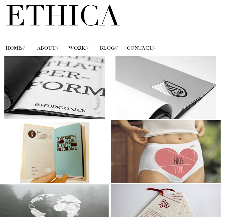
About I obviously kept the same layout throughout and within here i decided to add pictures of use with our USP. I typed this out as it would then make the website more searchable in google and such search engines as the type would be found. 

 With the work page I firstly decided to make them black and white then scroll over and they turned to colour. However as I was going with the simplistic white background it looked abit boring. So I decided to keep the colour yet once you click on a photo it enalrges.


I also decided to change and edit my own buttons for the window that pops out. I decided to change the type on the buttons to fit in with my design.


 The blogs page - this looks fairly simple! However the photographs are used as links and once you click on them they take you to each of our blogs.
 The contact page is kept clear and simple, with a map of our location containing tube references along with our address and email contact details.

My proposed idea.. 
My initial idea to start this whole project is that of an instore section (like the ball pool in ikea) where kids are dropped of by their parents to go and play whilst the parents shop around. 

For this I would want it to look something like this: 

Carrying the theme from the packaging and range onto the front of the instore section.
This would then be where the children would plant little pots given to them when they arrive. Those little pots are then taken home with the children.

Tuesday 24 May 2011

Name stickers for the children.


I think the tomato sticker would look quite good, but with the type I am not too sure.


The potato just doesn't work I don't think the type would stand out enough and also the shape doesn't work when the type is in one line.


 Although I do really like the onion with the type, however the people wouldn't be able to write on the design. However i do really like the carrot!! It fits the type in best compared to the other more rounded veg.

Creating a small little tub for children to take home with them: containing some soil and a seed. SOOOO i need to create the outside packaging. And also a way in which they can carry the tubs easily.. 


Designs for the packaging.. I want to obviously keep it close to the design on all the other packaging and product. I think the first out of these two looks better without the information on the back being in a white square.


When making the holder for the cups I decided that instead of just making the design 2D to actually make the grass stand up and make it 3D then have the hand blue and the underneath of the design brown as the mud! Brian wave!! 


The white circles representing where the cups would sit in, but wouldn't be printed on the packaging. Also the brown version is the underneath of the product  and the grass is going to stick up at the sides.


As I am proposing to make a instore section for children to play/grow plants as the parents are shopping around Homebase, I would need to design the headed paper for things such as the sign in sheets for the parents to sign when they drop their children of. A bit like the ball pools of which used to be at Ikea.

Tags for accessories and equipment..


 This one below is my favourite. I like the way in which the brand and identification of the product is on the front then any extra information is on the back; the barcode and warning information.

Tag to hold the product on the shelf (if they are a hanging product) 


Designs for the pinnies for both children and the adults...
I want to incorporate the logo yet be quite bold/fun.


Although I do think the cream and the brown pinnies do look ok, it's not what i wanted. I want the kids to want to put them on and i don't think these are attractive to children.


 I figured that the logo with the vectored image didn't stand out enough the images were too small. Therefore I am now trying using just the type from the logo.


 I think this one below is my favourite!! It uses the background from my packaging, and also stands out. I also think i prefer the type high up rather than waste height because people will see it better.


Website development.. 

Since its a high quality print for retail business I want it to be clean cut and have a serif font of which can speak for itself.