Wednesday, 22 December 2010

After Effects - Photoshop Files

When opening a document in Photoshop you need to:


And then save as a psd. 

---

Importing Type.

Type out your word
Crop it
Delete the background layer
Ensure the layer box is ticked
& Save as a Photoshop file.

---

When importing into After Effects:

File
Import


Footage: used for flat images
Composition Retain Layers: used for words & images with multiple layers.

Photoshop:

To split a word into different sections and also put the different sections onto different layers: 

File
Word
Type Rasterise

then..

Layer
Via Cut

then..

Import the type into After Effects as a Composition Retain Layers.

After Effects - the beginning.


When i first opened after effects i was lost!
So many panels, and different sections.


Project - down the left hand side.
This is where all your files are.


The Timeline - along the bottom. 


Composition
This is where your design is shown in the centre.


HDTV 1080 29.97


Theres also the timecode on there to allow you to change the length of your clip. Our frame will have to be 5 seconds.


Key Frames: These are the points at which changes happen such as moving things around or changing form or colour. You can have more than one at a time going for several different things.


Useful keyboard shortcuts:


~ expand active panel (active panel the one highlighted in yellow that you are working on)
P select layer & press 'P' shows position properties
A select layer and shows the anchor property
R select layer - rotation
T select layer - opacity properties
S select layer - scaler properties
O end of layers time frame
I beginning of layers time frame
U shows all modifications on the layer
UU reveals all modified properties
B beginning work area sets them
N end work area sets them


When creating an animation you will want to keep going back and making sure it looks how you want it to. To do this there is a playback menu at the right hand side:


How to export your animation Quicktimee into Vimeo & onto blog:


Composition - Add to Render Queue


Render Settings:


Time span: Length of Comp.


Lossless: Output Module
Format: Quicktime
Video Codec H.264

Output to: Save!

RENDER! 


Monday, 22 November 2010

Evaluation.

Through this module I have definitely gained a lot of knowledge of what print processes and techniques are available to me, along with the opportunities when designing the printer can provide, also the restrictions of a printer and the problems that may arise when printing. Through understanding the print process it allows you to prepare your work for print and know what can be printed and what can not and why, so you can amend it. Also when on the visit to the printers they definitely recommend going into the printers way before your deadline to see what they can do and how/if your design ideas would be possible to print at the printers. I have also learnt a lot about Illustrator and Indesign, just the small little things such as creating packaging from scratch on Illustrator of which I wasn't very confident doing.

The strengths in my work I think is the way in which I have responded to the initial idea of what is good, relating the work I have done to the hospice so it would and could actually be used. Also throughout this project I have solely worked on indesign for layout and also illustrator for my packaging. These programs are definitely not my strong point yet I have learnt a lot through forcing myself to use them. I also have gained a lot of knowledge of different techniques such as flocking, laser cutting, screen printing of which I will remember when creating and designing in the future.

My weaknesses within this project is understanding how the techniques and things work yet not trying some of them out. I would have liked to have tried a lot more techniques such as flocking and more screen printing techniques as then I could have broadened my designs and ideas of what I could have created.

If I was going to do this module again I would most definitely spend slightly less time hooked on researching into my chosen idea and looked more into the creative aspect sooner and tried more of a variety of techniques. I would have also like to do more things in screen printing and learn more about the techniques I can do in there. However through this project I have learnt how to do these techniques now I can go on and try them in a future projects and gain confidence in creating these things.

Through this module I have definitely gained a lot and have learnt a lot about printing and all the different techniques of which has really interested me and I would like to continue learning more into print and design for print.

Thursday, 18 November 2010

Final boards..


Promotional Poster..

For my posters they probably would be printed digitally because I would be looking at printing around 50 rather than litho which would be used for bigger prints. The poster would also be printed CMYK along with two spot colours, Pantone 311 and Pantone 157, I would also want it printed on white matt card 240gsm

To print the poster i would send it too the printers as a pdf along with the registration marks, crop and bleed marks as well as the colour bars so the printers can check the colour of the prints.


Final Packaging..

The packaging would most probably be flexo printed. I would also want the two circle on the front of the packaging to be spot varnished and the type in the right hand corner of the front page would be embossed. Which would all add to the cost of the product. Also in the inside of the packaging the join between the packaging and application form would need to be perforated.


Below the PDF format of my packaging that i would send to the printers with the crop and colour marks.


Also for the inside of the packaging i would have the set of business cards of which would have been litho printed. Then also the CD below which would have been pad printed! So becoming more and more expensive as there is becoming a list of different printing methods = more printed plates = more £££.


Stationary..


Final stationary design - my stationary would be litho printed, using two spot colours: Pantone 157C and 311C

Wednesday, 17 November 2010

Final Packaging.. 

I am pretty happy with my final result! at one point i thought i was going to run out of time, but i have done everything to it i set out to do. 

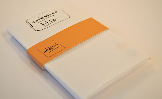
I decided to create a orange belly band with the address on to slightly add a bit more colour, then the two spots of colour in the corner. I also embossed 'Butterwick Childrens Hospice' in the top corner of the packaging.


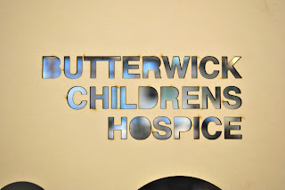
 I used the laser cut type to create this text of which has worked a lot better than my hand cut type!


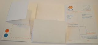
 The inside also works to hold the CD and envelope along with the application form and the dotted square for the business cards.

Stickers.

I decided to make stickers to test out colour on my packaging, I also wanted to use one for the belly band around my packaging. 


Packaging 2.


This is the second attempt at the packaging of which is more to scale and I have made most the changes to this packaging than the initial packaging.


This is me trying out embossing hand done, pretty bad right there as i tried it on paper rather than the card so it was a lot easier to rip the paper. Hopefully i'm a lot better at it when the text is laser cut and the stock is 240gm white card.


 I decided to add colour into the inside of the packaging as i did want it to look clean cut and professional, however it was far too plain with no colour, especially for something related to children.


Packaging 1.

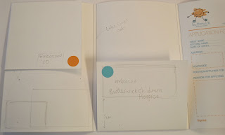
I printed a tester packaging out of paper to see how it would fit together and how it would look. 

I also used this version to write down edits i want to make to the packaging.


 On the inside the left section would hold several perforated business cards and also a section for the cd


Lasercutting. 

I laser cut Butterwick Childrens Hospice to be able to hand emboss the front of my packaging. To do this i had to make my type in Illustrator, create outlines, then ungroup the letters so that the lasercutter would recognise each shape of letter. I laser cut into mountboard so that it would be a thick enough for a deep embossing on card.