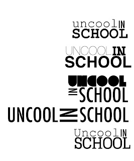
Iv decided to keep the title/logo of the program really simple, i just want to have a good 'geeky' font of which i think suits the idea and then animate it as if it is being typed. However for the actual logo i would like it to be simple and be highlighted, like the yellow one bellow however with white writing? or maybe the red logo highlight and white writing so it is more legible.
Showing posts with label OUGD202 - Branding. Show all posts
Showing posts with label OUGD202 - Branding. Show all posts
Sunday, 6 February 2011
Changed my mind...
though i thought my initial design for having quite a bulky logo was a good idea.
I know think it would be better to have a very simplistic logo.. something not as animated, slightly shy/boring as stereotypical 'nerds' are portrayed.
What i want to do it have the logo as the type itself, and make it look like it has been typed on the computer.
Saturday, 5 February 2011
Logo - with this I wanted to try animating my branding as it was to link it into the starting of the title sequence.
Untitled from Kimberley Sandford_91256 on Vimeo.
Untitled from Kimberley Sandford_91256 on Vimeo.
What i might possibly do is to animate the pencils and images more? Could maybe have the pencil draw a bow around the logo?
Sunday, 30 January 2011
After adding the glasses and type together I then thought about adding a pencil or something like this to the logo underneath the 'IN' as there was quite an empty space left there, of which would nicely fit something like this!
I do quite like it, but instead of two pencils maybe a pen and a pencil something like that. As two pencils doesn't really make sense.
I do quite like it, but instead of two pencils maybe a pen and a pencil something like that. As two pencils doesn't really make sense.
Visuals -
For my branding i thought it would be pretty cool to add an image in with the type as this is what i am hoping to do with my animation.
I thought the glasses would be a good idea with there being two o's in the word 'uncool'
Now for the type!
Which type will best suit being alongside the glasses and also represent uncool.
I think this type is possibly too bold to convey the idea of a nerd, however i do think it fits in well with the glasses.
I'm not too certain on this font either because i think it doesn't quite fit with the glasses and also doesn't really express the idea of being uncool.
I think this type is getting closer.. Maybe using several different fonts could work?
Branding!
As my animation is 'The top 10 reasins why i was not cool in school' and it is for a comedy program I want the logo to be kind of fun!
As my animation is 'The top 10 reasins why i was not cool in school' and it is for a comedy program I want the logo to be kind of fun!
Open publication - Free publishing - More type
For the type i want to use two different fonts for Uncool and school. For Uncool I want it to bee sans serif i think and thin. Whereas the school maybe slightly thicker? Possibly sans serif.
For the type i want to use two different fonts for Uncool and school. For Uncool I want it to bee sans serif i think and thin. Whereas the school maybe slightly thicker? Possibly sans serif.
Subscribe to:
Posts (Atom)


