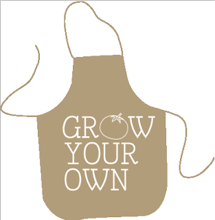
Designs for the pinnies for both children and the adults...
I want to incorporate the logo yet be quite bold/fun.
Although I do think the cream and the brown pinnies do look ok, it's not what i wanted. I want the kids to want to put them on and i don't think these are attractive to children.
I figured that the logo with the vectored image didn't stand out enough the images were too small. Therefore I am now trying using just the type from the logo.
I think this one below is my favourite!! It uses the background from my packaging, and also stands out. I also think i prefer the type high up rather than waste height because people will see it better.


No comments:
Post a Comment