Tuesday, 22 March 2011

Monday, 21 March 2011


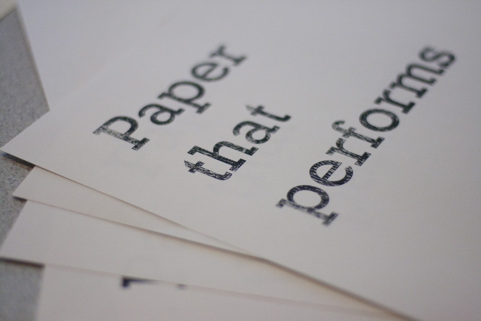
Different posters..
We wanted to create a poster campaign and then use these posters in a sample book of which would


Friday, 18 March 2011
Type - Week 9
I quite like this layout below. You firstly see my name, then curriculum vitae then look into the text. i really like the justified text! Think it looks neat, i also like the way in which everything is aligned with the end of my name, this also works nicely!
 Not too sure about this layout! I don't think the list effect on the right really works, and then it goes back to the justified style, looks odd!
 I quite like my name in the centre! This looks quite nice but again not too sure on anything else within this design.

 I think having the text smaller works much better! Although I don't really like the layout of this design.
 Now I'v changed my mind! I like the text in the bottom right hand corner however I'm not sure about the logo where it is.
 Smaller??
 I think I really like this one! The logo will grab your attention, then the hierachy in my opinion works and is still simplistic and looks good.
I quite like this layout below. You firstly see my name, then curriculum vitae then look into the text. i really like the justified text! Think it looks neat, i also like the way in which everything is aligned with the end of my name, this also works nicely!


I don't think this really works as I feel like my name and my logo are competing to be seen first. Which this shouldn't happen they should compliment eachother.


Subscribe to:
Posts (Atom)