To package my range I would need to have information for each produce..
Tuesday, 17 May 2011
Better still..
I really liked the design of the first logo although it was too big.
Therefore i have combined both ideas.
I have used a tomato as an O in the big design therefore i can use the big logo idea for bigger packages then when something is slightly smaller just use the type with the tomato in it.
I really liked the design of the first logo although it was too big.
Therefore i have combined both ideas.
I have used a tomato as an O in the big design therefore i can use the big logo idea for bigger packages then when something is slightly smaller just use the type with the tomato in it.
Although i really liked the other design with more than one vegetable it proved abit big to put onto designs used as a logo.
And this is where this design has come from! I have used the colours of traffic light as you begin to grow the product then you end up with your vegetable that the child has grown.
I have also made it smaller in size as to function as a logo.
Monday, 16 May 2011
Friday, 13 May 2011
Colour swatches.
For my colours I am thinking they need to be bold and eye catchging, aswell as needing to attract the target audience of children between 5 - 10. The colours must also be unisex and relate to gardening!
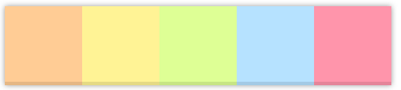
I quite like this swatch below: Although the lighter version is lower down of which I think would look quite good also!!
For my colours I am thinking they need to be bold and eye catchging, aswell as needing to attract the target audience of children between 5 - 10. The colours must also be unisex and relate to gardening!
I quite like this swatch below: Although the lighter version is lower down of which I think would look quite good also!!
Logo Ideas..
I want something fun, with images also as it has to relate to children of a young age.
Therefore has to be fun yet informative.
I quite like the idea of making an alphabet of fruit and veg! However i am uncertain that this along with everything else I am hoping to do wouldn't fit in the time scale.
I really like this logo below at the bottom! I like the idea of having the plate as it were at the front with illustrations of the products the target audience would use/make.
Initial drawing of veg to then take onto the computer..
Subscribe to:
Posts (Atom)