Thursday, 31 March 2011

Web Introduction

Take into account the fact that your website will be judged in the first 5 seconds of it being open.

What you need to make sure:

- Clear navigation: where is the navigation, how big are the links, how do you go back.
- Files need to be organised into a folder and all of a smaller size file which doesn't take long to upload onto the website.
- Font, if you are going to use a special font of which may not be on everyones computers it needs to be uploaded as an image so not to turn to the default type of Times Roman.
- Photoshop - New - Web - 800 x 600 - RGB


I think for my website I would stick to having my navigation bar either along the top of the page with my logo in the left hand corner, or having the navigation bar down the left hand side. I would also chose a white background for my website to show off my work.


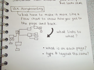
Creating a design for a website. We needed to think about the links between the pages, how people would get to each page and also back and link with the homepage. 

First attempt, stupidly I used 6 pages when usually 5 page maximum for a small website like we would be creating. Also why would we have clients? Stupid! 


 Second attempt worked better it all also linked back to the home page and there was also an easy way to click back to the page you were just on. However lorraine said for everyone to think about our sub pages. How many you would actually need and want for the information on the website.

Monday, 28 March 2011

Type Module - Session 10
Looking at different/creative ways to split the paragraph.

 Could be slanting the indentations? Or using kerning on the last line to 'underline' the paragraph.
 
 Maybe just using tabbing within the paragraph.

Filling in the rest of the line with colour?

Tuesday, 22 March 2011

Contact page.. 
For the sample book we needed a page at the back of the book of which would inform the potential customer could then get in touch if they did indeed want a sample.


Mailshot


Sophie had created this mailshot, we wanted to create a folded outter packaging for the smaller sample book of which we would send out to people. To do this sophie screen printed white onto black.
For the sample book we are putting in the poster campaign along with other additions such as a contact page and front cover. The sample book will be at the Fedrigoni office and a smaller version will be available as a mail shot sent to potential clients.

Monday, 21 March 2011

Putting posters into context..

We want to put the posters in design studio waiting rooms, for people to be able to sit and read, this will also target our audience perfectly as they will be the people we would want to purchase the product.
 With one of the paper samples Sophie embossed it, of which we think we may use on the front page of the book, although would have to be in black as Fedrigoni in the brief asked for any outer packaging to be black.
Different posters.. 
We wanted to create a poster campaign and then use these posters in a sample book of which would 

 The first poster above is the flocking.
 We also came up with a list of the versatility of the paper, one of which was fold. Hence the design of the poster above.
 This poster shows the list of things the paper can do.

 This poster holds a sample of the Fedrigoni range, and is also embossed along the top of the page.

 This poster above is a variation on layout and type, along with all the information needed to be on the page.


Laser cutting.
Using the letters from the lasercutting we had abit of a play around.. 


 This laser cutting sheet was out of mountboard ready to use with embossing.


Effects from foil blocking!
We decided to foil block white onto black type to see what it would look like. It created a sort of textured effect, of which we quite liked.


Friday, 18 March 2011

Type - Week 9

I quite like this layout below. You firstly see my name, then curriculum vitae then look into the text. i really like the justified text! Think it looks neat, i also like the way in which everything is aligned with the end of my name, this also works nicely!
 Not too sure about this layout! I don't think the list effect on the right really works, and then it goes back to the justified style, looks odd!
 I quite like my name in the centre! This looks quite nice but again not too sure on anything else within this design.
I don't think this really works as I feel like my name and my logo are competing to be seen first. Which this shouldn't happen they should compliment eachother.
 I think having the text smaller works much better! Although I don't really like the layout of this design.
 Now I'v changed my mind! I like the text in the bottom right hand corner however I'm not sure about the logo where it is.
 Smaller??
 I think I really like this one! The logo will grab your attention, then the hierachy in my opinion works and is still simplistic and looks good.