Saturday, 30 October 2010

Initial ideas.. 

-become a volunteer for the charity
-make a pack for the children
-a game for children to play with
- a volunteer event
-things to teach the children and interact with eachother


Tuesday, 19 October 2010

GOOD is .... The Butterwick Children's Hospice. 

Why?


  1. its funded through self driven fundraising.
  2. the team work together to make the hospice work.
  3. lets the families rest from 24/7 care.
  4. a safe place for the ill children to play and interact with others.
  5. a lot of facilities for the children ie the light room.
I intend to.. 

Persuade people to volunteer at the Hospice.

A group of..

both men and women from 19 - 35.

That..

becoming a volunteer is a positive thing to do.

In order to achieve this i will produce.. 

mails shots, possible a book/leaflet (leaflet could be a fold up poster and informational product?)
i want to collect promotional pictures.

This will be produced using..

Pad Printing, Lithography, Embossing & Die Cutting.
Wrap it up.

Brief: Create three packaging ideas, containing one image and one word of which you think represents your What Is Good research.

We were given 15 nets to chose from and had to chose one package from each group. After that we then had to chose our 3 favourite packages to work on further to create our final 3 packages.

We had to think about what one word we thought would represent our 'good', the tone of voice.

We were limited to two colours plus stock.


I chose to use the word 'smile' with this i firstly used a picture and wanted to highlight the smile on her face. For the packaging i thought about making a series of packages that were quite simple yet the smile was visible from the outside with the actual picture on the inside.

 I tried with yellow along with blue but I'm still not happy. I think it looks like more about speaking than about smiling and it being positive.

 I then added text, but i didn't think this worked either although i though it was better than my original designs.


I then decided to possibly try using drawings rather than an actual photograph. Of which i though might work quite nicely. As in this packaging below I thought this would look pretty cool to have the mouth cut out and possible have the tongue and inside of the mouth printed on the inside of the packaging.


 This was just another version of my smile, with a slightly thinner line.

 I quite like this smile in comparison to the next smiles below as it does express smiling but still there is enough space within the mouth to possibly add some text or the address the package might be sent to.

 I don't think this smile works at all really! I think it looks possibly a bit dumb? or goofy which isn't really what i wanted i want more of an infectious smile.

 With the packaging i thought it could be an idea to have the smile on the inside of the packaging in different colours and quite bright, however im not keen on this idea.

 Then i thought maybe i could have the text on the inside and the smile on the outside??

 I also tried experimenting with colour, however this orange and blue does not work together!

 I then thought about possibly cutting out text instead of an image, so rather than cut out the smiling mouth cut out the letters of the word!


I thought this would be a much better idea to have the word cut out. And possibly use the packages as some sort of little gift to send to people. 

Below are the 3 packages i decided to use in this quick project.

1.

I ended up editing this package quite a bit and adding more folds to make a small little book.

2.
  

3.

I wanted packages that all could be posted as this is what i intended to do for my 'what is good' project. I also wanted them to be quite different yet use the same design to link them together.

Instead of the smiling face I decided to go for the text, as i thought that i would be more likely to use type and play with type in my what is good brief rather than small characters and illustrations.


I also then decided to cut out the text, although if it was going to be done professionally or if i was going to do this again I could have got is laser cut which would have made it look much more professional.

 my first design came from the packaging 2. however i changed it slightly to add more folds to create this affect of which i could then cut the letters out of the folds to make them pop out of the page. I also made it quite small as i would like it to be a postable object and to be able to send them.


 This design was the 1. net. of which i kept basically the same, yet it fits in with the other designs because of its simplicity.


Feedback from other students:


If i was to do this again I would definitely try to not over think things. I spent a lot of time i did not have on trying to think of creative way of which I could make the packages, rather than spending the time trying different things and actually doing things. Not one of my strongest projects although i really do like the package of the small pocket size book with the letters that pop out when its opened. 


Thursday, 14 October 2010

Type Workshop
14.10.10

When deciding on type for such a thing as a leaflet, it should be printed out so you can decide which point size and leading should be used to make it easier to read.

Different layouts of the type to determine how the proverb is read. Layout depends on hierachy, what is the most important? and what do the people need to know first.
Wednesday, 13 October 2010

InDesign.

Always work on a Document.
Even if you want to print a book, use facing pages.

Working for commercial print:

Photoshop:
-Resolution 300 dpi
- CMYK, Grayscale, Duotone,
-File Format, psd or tiff to put into InDesign.
-Make your work actual size you want it to move into InDesign.

Illustrator:
-CMYK
-File Format ai. Don't cut and paste artwork.

When you place and image into InDesign it creates a link. So if you go to the links menu at the side and scroll over the image name it will tell you where the image is.

So when you got to print you need to take the InDesign document and all the images you want.

Make a folder for all things you have used in your InDesign layout and take this along to the printer so it prints everything.

Fonts & images need to be stored in a folder alongside the Indesign document

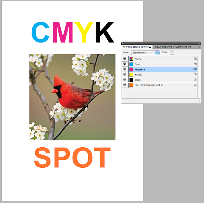
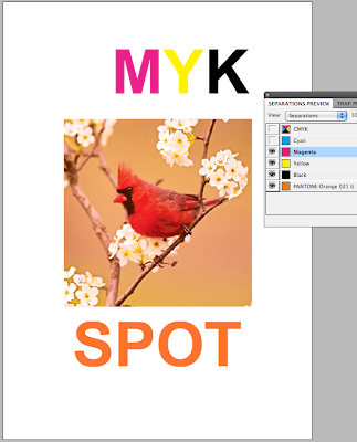
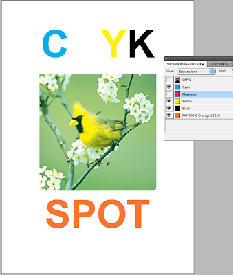
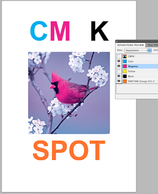
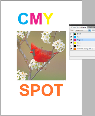
Separations:

Colour separations is to see how many different printing plates you would need for your work. Such as screen printing when you have to print each colour seperatly.

Windows - Outputs - Seperations.


When printing if you go to Output then select separations from the drop down menu, this will then print 5 separate sheets of the same design for each of the different colours. All of which will be in black and white format.

The more colours means more printing plates needed which means the price of the print job will go up and become more and more expensive.

When designing for print, good practice is to clear your swatches from all un used spot colours so there is no confusion of what is going to be printed.

Also when printing add the printing information onto the document such as crop marks and the registrations.

Overprint.

Window - Output - Attributes.

Overprinting allows you to print a two colour document, so using two plates, overprinting would allow you to create another colour from your chosen two colours mixing. Knocking out is when the overprint is not selected and the spot colour will knock out the background rather than print on top of it.

Ink Limit: ink limit is the amount of ink that can be applied to your stock before it starts to discintigrate. Once you know what your stock is and how much it can take..

Once you know this in the separations menu you can go on the drop down menu and select ink limit and set your ink limit. So when overprinting if there is too much ink on the page it will highlight it.

Spot colour - when it goes to print in your swatches you have the colours you have used on your design then add another spot colour to the swatches and ask the printer to not print the spot colour but to spot varnish where that colour is. But make sure that the overprint setting is used with the spot colour so that the colour isn't knocked out, as it wants to be printed on top of the picture behind rather than loose the picture where the spot colour is.


Monday, 11 October 2010

Maybeeeee....

I could create a series of things promoting working as a volunteer at the hospice, and do all the different ways of volunteering you could take up not just the obvious as there are many other roles needed to run the hospice
Ideas for printing...

Things I would want to print onto to promote the Hospice:

- Flyers
- Posters
- Mailshots
- Leaflets
- Bags
- Thank you cards
- Letterheads
- Pens
- Umbrellas
- Balloons
- Notebooks
- Badges for staff
- Stickers for kids?
- Oversized crayons & Packet
- Colouring books?
More ideas...


Maybe a pack for the children on their first visit to the hospice?
Something given to the children?
Something for the charity within the hospice?
Do a workshop within the charity? An event promoting the hospice and what it does for people.

Promote the charity.
Re-branding, campaigns for more volunteers
Or to raise money for the charity?
Advertise the events going on within the charity?


I think i'm going to go with the promoting side, promote the hospice & becoming a volunteer and what this could mean for them to not just the charity.

Thursday, 7 October 2010

To deicde on layout of type, you have to say it out loud to decide on breaks and how it should sound when something is read.

How do you read these? .... What do you see first/ at first look.